

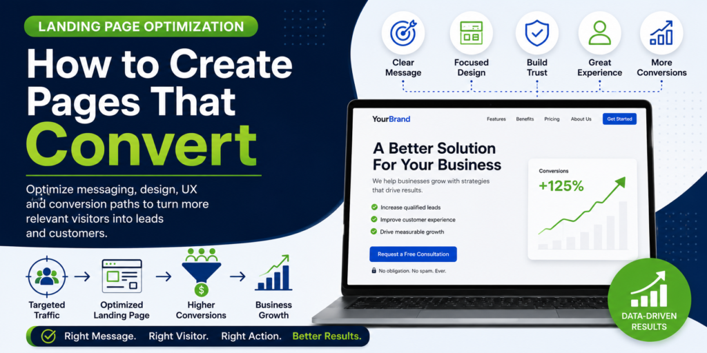
A landing page can receive highly relevant traffic and still fail to generate the results a business expects. The problem is often not the amount of traffic, but what happens after visitors arrive. If the message is unclear, the offer is difficult to understand, trust is weak, or the next step creates unnecessary friction, valuable visitors can leave without taking action.
Landing page optimization is the process of improving the content, structure, experience, and conversion path of a landing page so that relevant visitors can understand the offer and take an appropriate next step. Effective optimization considers much more than visual design. It connects visitor intent, messaging, value proposition, page architecture, trust, calls to action, forms, usability, and measurement.
The strongest landing pages are built around a specific purpose. A lead-generation page may be designed to generate qualified enquiries, a product page may encourage a purchase, and a campaign landing page may guide visitors toward a specific offer. The page structure, messaging, and conversion path should reflect that objective.
This makes landing page optimization an important part of Conversion Architecture System™. A landing page is not simply a destination for traffic; it is a conversion environment where the expectations created by search, advertising, referrals, or other acquisition channels meet the actual customer experience.
In this guide, we’ll examine how to create and optimize landing pages around visitor intent, messaging, page structure, trust, user experience, calls to action, forms, testing, and measurable business outcomes.
Table of Contents
What Is Landing Page Optimization?
Landing page optimization is the systematic improvement of a landing page to make it more relevant, understandable, trustworthy, usable, and effective at guiding the intended visitor toward a defined action.
A Landing Page Needs a Clear Conversion Objective
Before optimizing a landing page, define what the page is supposed to accomplish. A page cannot be evaluated effectively if its primary objective is unclear or if visitors are presented with multiple competing actions.
The objective might be generating a qualified lead, requesting a consultation, starting a purchase, registering for an event, downloading a resource, booking an appointment, or completing another meaningful action.
Once the objective is clear, the page can be evaluated against how effectively it helps the intended visitor understand the offer and move toward that action.
Landing Pages Are Different From Ordinary Website Pages
Not every website page needs to function like a landing page. Service pages, educational articles, category pages, product pages, and company pages can have different purposes and may support several stages of the customer journey.
A landing page is usually more focused on a particular audience, offer, campaign, intent, or conversion objective. Its content and structure can therefore be more tightly aligned with the reason the visitor arrived.
This focus does not mean removing useful information. It means ensuring that the information presented supports the visitor’s decision rather than distracting them from the primary objective.
Start With Visitor Intent
The same landing page will not necessarily work equally well for every visitor. Someone actively searching for a specific service may need a different experience from someone encountering an introductory advertising message for the first time.
Understanding visitor intent helps determine what information should appear first, how much explanation is required, what proof should be provided, and which call to action represents the most appropriate next step. This is a core principle of Conversion Rate Optimization because the conversion experience needs to reflect what the visitor is trying to accomplish.
A strong landing page therefore begins with the visitor’s context rather than the business’s preferred design.
Landing Page Optimization Starts Before the Visitor Arrives
A landing page’s effectiveness is influenced by the source and message that brought the visitor there.
Match the Landing Page to the Acquisition Message
Visitors create expectations before they click. A search result, advertisement, email, social post, referral, or other acquisition message communicates something about what the visitor expects to find. For paid campaigns, this alignment is an important part of a Performance Marketing System™.
If the landing page delivers a different message, offer, audience, or experience, the visitor may become uncertain about whether they have reached the right destination.
Strong message alignment creates continuity between the acquisition source and landing page. The visitor should be able to recognize that the page delivers on the expectation that prompted the visit.
Match Search Intent to the Landing Experience
Organic search visitors also arrive with a specific reason for searching. The landing page should provide an experience that matches the intent behind the query rather than simply repeating the keyword that brought the visitor there. This alignment between search intent and digital experience is central to Search Intelligence Infrastructure™.
For example, someone searching for a specific service may expect to understand the service, its benefits, suitability, process, evidence, and next steps. Someone searching for a broader informational topic may need education before being presented with a commercial action.
Understanding this difference can help businesses create landing experiences that feel relevant instead of forcing every visitor into the same conversion path.
Build the Landing Page Around a Clear Value Proposition
Once the visitor’s intent is understood, the page needs to communicate why the offer is relevant and worth considering.
Write a Headline That Establishes Relevance
The headline is often one of the first elements a visitor uses to determine whether they are in the right place. It should communicate the primary value or outcome of the page clearly enough that the visitor can quickly understand its relevance.
A strong headline does not need to explain everything. Its job is to establish context and encourage the visitor to continue into the supporting information.
The most effective headline will depend on the audience, offer, and intent behind the visit. A headline that works for an awareness campaign may not be appropriate for a high-intent service landing page.
Make the Value Proposition Easy to Understand
The value proposition should answer a basic question: Why should this visitor care about this offer? It should connect the solution to a relevant problem, desired outcome, or benefit rather than relying only on a list of features.
Clarity matters because visitors rarely evaluate a landing page in a perfectly linear way. They scan headings, supporting copy, visual elements, proof, and calls to action while deciding whether the offer deserves further attention.
A clear value proposition gives those visitors an immediate reason to continue while creating a foundation for the more detailed information that follows.
Lead With Benefits, Then Support Them With Features
Features describe what a product or service includes, while benefits explain why those features matter to the customer. Landing pages should make the connection between the two clear.
For example, a technical capability may not be compelling on its own. Explaining how that capability reduces manual work, improves reliability, saves time, or supports a desired outcome makes its practical value easier to understand.
The balance between features and benefits should reflect the visitor’s knowledge and decision stage. Technical buyers may require deeper specifications, while earlier-stage visitors may need a clearer explanation of the problem and outcome first.
Structure the Landing Page Around the Decision Journey
A landing page should not simply contain all the information a business wants to communicate. Its structure should help visitors move from initial understanding toward confidence and action.
A Practical Landing Page Structure
| Page Element | Primary Purpose | Question It Should Answer |
| Headline | Establish relevance | Am I in the right place? |
| Value proposition | Communicate the core benefit | Why should I care? |
| Benefits | Explain the outcome | What will I gain? |
| Features / details | Provide supporting information | How does it work? |
| Proof | Build confidence | Can I trust this? |
| Objection handling | Reduce uncertainty | What could stop me? |
| CTA | Define the next step | What should I do now? |
| FAQ | Resolve remaining questions | What else do I need to know? |
This structure is not a rigid template. Different landing pages will require different elements and ordering depending on the audience, offer, complexity, and conversion objective.
The important principle is that each section should have a purpose within the visitor’s decision process. Information should help the visitor understand, evaluate, trust, or act rather than simply making the page longer.
A longer landing page is not automatically better, just as a shorter page is not automatically more effective. The appropriate length is determined by how much information the visitor needs to make a confident decision.
Address Objections Before the CTA
Visitors may hesitate because they have unanswered questions or concerns. These could relate to price, implementation, suitability, risk, results, technical requirements, timelines, support, or what happens after they take the next step.
Addressing relevant objections within the landing page can reduce uncertainty and make the final action easier to evaluate.
The goal is not to anticipate every possible question. It is to identify the concerns most likely to prevent the intended audience from progressing and provide clear, credible answers.
Build Trust Into the Landing Page
Trust is often a prerequisite for conversion, particularly when the visitor is being asked to provide personal information, make a purchase, schedule a consultation, or commit to a significant business decision.
Use Relevant Social Proof
Testimonials, reviews, case studies, customer examples, and other forms of social proof can help visitors understand that other people or organizations have successfully worked with the business.
The most useful proof is specific to the decision being considered. A testimonial that directly addresses the service, problem, or outcome is generally more useful than generic praise.
Where possible, proof should provide enough context to help visitors understand who achieved the outcome, what problem they faced, and what changed as a result.
Demonstrate Expertise Without Overloading the Page
Credentials, experience, certifications, publications, client examples, methodologies, and other evidence can strengthen credibility when they are relevant to the visitor’s decision.
However, credibility should emerge from the overall experience rather than from an excessive collection of badges and claims. Clear information, transparent processes, useful content, and consistent messaging can all contribute to trust.
The strongest landing pages give visitors enough evidence to feel confident without turning the page into a catalogue of self-promotional statements.
Use Trust Signals Where They Matter
Trust signals are most useful when they appear near moments of uncertainty or commitment. A security indicator near a payment action, a relevant testimonial near a service CTA, or clear information about what happens after submitting a form can address concerns at the point where they arise.
This is more effective than placing every possible trust element at the bottom of the page without considering what visitors need at different stages of the decision.
Make the Conversion Action Clear
Once the visitor understands the offer and has enough confidence to continue, the page needs to make the next action obvious.
Use a CTA That Matches the Offer
A call to action should tell visitors what will happen when they take the next step. Clear language such as requesting a consultation, starting a trial, booking an appointment, getting a quote, or completing a purchase can create a stronger expectation than vague labels such as “Submit” or “Learn More.”
The CTA should also reflect the commitment being requested. A high-value service may require a consultation before a purchase decision, while a straightforward product may allow visitors to buy immediately.
The objective is to make the next step feel logical rather than forcing visitors into an action they are not yet ready to take.
Avoid Competing Calls to Action
A landing page designed around one primary conversion objective can lose focus when several unrelated calls to action compete for attention.
Secondary actions can still be useful when they support visitors who are not ready for the primary conversion. The important distinction is between a secondary pathway that helps the journey and an unrelated action that pulls attention away from the primary objective.
The page should make the preferred next step visually and contextually clear while still giving visitors an appropriate alternative when necessary.
Reduce Friction in Landing Page Forms
Forms are often the final point between visitor intent and a completed lead conversion, which makes unnecessary friction particularly costly.
Ask for Information the Business Actually Needs
Every field creates an additional requirement for the visitor. Businesses should therefore evaluate whether the information requested is genuinely necessary at that stage of the relationship.
A B2B consultation form may reasonably require more information than a newsletter signup because the business may need to qualify the opportunity. The right number of fields depends on the value of the conversion, the sales process, and what happens after submission.
The objective is not to create the shortest possible form. It is to create an appropriate exchange between the effort required from the visitor and the value of the next step.
Explain What Happens After Submission
Uncertainty can make visitors hesitate before submitting a form. They may not know whether they will receive an immediate response, enter a sales process, receive a proposal, or simply have their information stored without further context.
A short explanation of what happens next can reduce that uncertainty. Where appropriate, businesses can communicate expected response times, next steps, information requirements, or what the visitor will receive after completing the form.
This turns the conversion from an ambiguous action into a more predictable part of the customer journey.
Design for Usability and Reduced Friction
A landing page can contain the right content and still create friction if visitors struggle to navigate, read, interact with, or understand it.
Make Important Information Easy to Find
Visitors should not have to search through large blocks of content to find information that is critical to their decision. Headings, spacing, visual hierarchy, concise copy, and meaningful page sections can make important information easier to scan and understand.
This is particularly important for visitors comparing options or evaluating a complex service, where the page may need to provide substantial information without becoming difficult to navigate.
Good information design helps visitors control how deeply they engage with the page. They can scan for the key message first and explore supporting details when they need additional confidence.
Remove Unnecessary Distractions
Every element on a landing page competes for some degree of attention. Navigation, promotional messages, unrelated offers, animations, pop-ups, social feeds, and other elements can distract visitors from the primary conversion objective when they are not carefully considered.
This does not mean every landing page should remove navigation or become visually minimal. The appropriate level of focus depends on the campaign, audience, website structure, and business objective.
The better principle is to ask whether each element helps the visitor understand, evaluate, trust, or act on the offer.
Follow Established Usability Principles
Landing page optimization should account for how people actually interact with digital interfaces rather than assuming visitors will carefully read and understand every element.
Clear hierarchy, recognizable interaction patterns, readable content, predictable navigation, and visible feedback can all reduce unnecessary cognitive effort.
“Usability is a quality attribute that assesses how easy user interfaces are to use.”
The principle is simple: visitors should be able to understand what a page offers, determine what they can do next, and complete important actions without unnecessary confusion.
Optimize Landing Pages for Mobile Visitors
Mobile visitors may experience the same page under very different conditions from desktop users. Smaller screens, touch interaction, varying connection quality, and different browsing contexts can all affect how easily visitors complete a conversion journey.
Make the Primary Action Easy to Use
Important buttons and interactive elements should be easy to identify and use on smaller screens. Visitors should not need to zoom, repeatedly scroll, or precisely tap a small target to continue.
Forms should also be designed around mobile interaction. Appropriate field types, readable labels, sensible spacing, and a clear progression can reduce unnecessary effort during completion.
Mobile optimization should therefore be evaluated against the complete conversion journey rather than only whether the page technically responds to different screen sizes.
Prioritize the Information Mobile Visitors Need
Limited screen space makes information hierarchy particularly important on mobile. Visitors should be able to identify the offer, understand the primary benefit, recognize the next action, and access important supporting information without navigating through unnecessary complexity.
This does not mean hiding important information simply to make the page shorter. It means structuring the content so visitors can progressively access the depth they need.
Use Analytics and Testing to Improve Landing Pages
A landing page should not be considered finished simply because it has launched. Measurement can reveal where visitors are progressing, where they are dropping off, and which opportunities deserve further investigation.
Measure the Landing Page Against Its Objective
The metrics used to evaluate a landing page should reflect its intended outcome. A lead-generation page may need to focus on qualified enquiries, while an ecommerce landing page may prioritize purchases, revenue, average order value, or other commercial outcomes.
Supporting metrics such as engagement, scroll depth, time on page, or clicks can provide useful context, but they should not replace the primary conversion objective.
This distinction prevents businesses from declaring a landing page successful simply because visitors interacted with it more, even when meaningful business outcomes have not improved.
Identify Where Visitors Leave
Analytics can help identify points where visitors frequently exit or fail to progress. A high drop-off rate may indicate an issue with the offer, messaging, page structure, trust, technical functionality, or another part of the journey.
The data does not necessarily explain the cause by itself. A drop-off pattern should be treated as a signal that requires further investigation rather than proof that one particular page element is responsible.
The data does not necessarily explain the cause by itself. A drop-off pattern should be treated as a signal that requires further investigation rather than proof that one particular page element is responsible. A broader Website Analytics and Conversion Tracking framework can help connect these behavioural signals with the conversion actions and customer journeys that matter to the business.
Test Changes With a Clear Hypothesis
A landing page should not be changed simply because a different version looks better to the internal team. Optimization becomes more useful when each change is connected to a specific problem, hypothesis, and measurable objective.
For example, if visitors appear to understand the offer but hesitate before submitting a form, the hypothesis might relate to uncertainty around what happens after submission. A change could then address that specific concern and be evaluated against the relevant conversion outcome.
This approach makes optimization more systematic and helps teams learn from both successful and unsuccessful changes.
Don’t Assume Every Test Needs an A/B Test
A/B testing can be useful when there is sufficient traffic, conversion volume, and a suitable testing environment. However, not every landing page has enough data to support a reliable controlled experiment.
Other methods—including usability testing, customer interviews, qualitative feedback, analytics analysis, and technical investigation—can provide valuable evidence when controlled experimentation is not practical.
The right method depends on the question being investigated and the evidence required to make a confident decision.
Personalization and Landing Page Relevance
Not every visitor needs exactly the same landing experience. In some situations, adjusting content or pathways to reflect audience characteristics or acquisition context can improve relevance.
Match the Experience to the Audience
Different audiences can arrive with different needs, objections, levels of awareness, and expectations. A landing page designed for an enterprise buyer may need a different emphasis from one targeting a small business, even when both are considering the same underlying service.
Where meaningful audience differences exist, businesses can create more relevant experiences through dedicated landing pages, audience-specific messaging, campaign variations, or carefully implemented personalization.
The objective should be meaningful relevance rather than personalization for its own sake. Adding someone’s name or changing minor visual elements does not automatically create a better conversion experience.
Maintain Message Consistency Across Variations
When multiple landing page variations are created, the core value proposition and business promise should remain consistent with the acquisition source and the actual offer.
Personalization that creates a misleading expectation can damage trust rather than improve conversion.
Every variation should therefore be evaluated against the same fundamental question: does this experience make the offer more relevant and easier to understand for the intended visitor?
Common Landing Page Optimization Mistakes
Designing for the Business Instead of the Visitor
Businesses naturally want to communicate everything they offer, but a landing page becomes less effective when the visitor has to navigate through a long list of internal priorities before understanding what matters to them.
The page should be structured around the visitor’s questions, needs, objections, and decision process while still communicating the information required to make an informed choice.
Adding Too Much Information
More content does not automatically create more confidence. Excessive copy, repeated claims, unnecessary sections, or competing messages can make it harder for visitors to identify the information that actually matters.
The solution is not necessarily to make every landing page short. It is to make every section purposeful and ensure that the depth of information matches the complexity of the decision.
Removing Important Information to Make the Page Shorter
The opposite mistake is stripping away information that visitors genuinely need in order to feel confident. Complex services, high-value purchases, and considered decisions often require more explanation, evidence, and objection handling than simple transactions.
A useful landing page is therefore not defined by word count. It is defined by whether it gives the intended visitor enough relevant information to understand, evaluate, trust, and act on the offer.
Optimizing for Clicks Instead of Outcomes
A higher click-through rate can look positive while producing little improvement in qualified leads, sales, or revenue. This can happen when a CTA becomes more attractive without improving the quality of the resulting journey.
Landing page optimization should therefore connect page-level metrics with downstream outcomes wherever the business model and measurement infrastructure allow it.
Landing Pages Within a Broader Conversion Architecture
A landing page is one component of the conversion system rather than the entire system itself.
Connect Acquisition With Conversion
The landing page sits at the point where acquisition intent meets the website experience. Search, advertising, referrals, content, and other channels can bring visitors into the journey, but the landing experience determines what happens next.
This makes message alignment particularly important. The promise made before the click should be reflected in the experience after the click, while the page should provide the information and action appropriate to the visitor’s intent.
When acquisition and landing experiences are designed together, businesses can evaluate the journey as a connected system rather than optimizing each channel independently.
Connect Landing Pages With the Website Foundation
Landing pages also depend on the technical environment supporting them. Performance, responsive behaviour, forms, analytics, CRM connections, content management, integrations, and other infrastructure can influence whether the intended experience actually works.
This is why landing page optimization should not be separated completely from the underlying website architecture. A strong design is only useful when the technical environment can deliver it reliably.
The landing page is therefore both a conversion experience and a technical implementation within the broader website system.
Connect Conversion With What Happens Next
A successful landing-page conversion often begins a new stage rather than ending the customer journey. A form submission may require qualification, a booking may require confirmation, and a purchase may trigger fulfilment, support, retention, or additional communication.
Understanding what happens after the conversion helps businesses evaluate whether the landing page is generating genuinely valuable outcomes.
This also creates opportunities to connect landing-page data with the workflows that manage leads, customers, communications, and follow-up.
The Mavenify Approach to Landing Page Optimization
At Mavenify, landing page optimization is treated as part of the broader conversion system rather than as a standalone page-design exercise. The objective is to understand who the page is intended for, why they arrived, what they need to understand, what may prevent them from acting, and what outcome the business needs from the interaction.
This means the landing page is evaluated alongside its acquisition source, messaging, website architecture, content, user experience, technical implementation, analytics, and downstream customer journey.
The result is a landing experience designed around a specific visitor intent and business objective rather than a generic page template that is expected to work for every audience and campaign.
Landing Pages Within Conversion Architecture System™
A landing page is one component of a larger conversion environment. Traffic quality, visitor intent, messaging, content, trust, UX, technical performance, conversion paths, measurement, and follow-up can all influence what happens after someone arrives.
This is why Mavenify’s Conversion Architecture System™ considers landing pages as part of the wider customer journey rather than isolated campaign assets.
The objective is to create a connected experience where each important element supports the next stage of the visitor’s decision process.
A Practical Landing Page Optimization Checklist
Before launching or revising a landing page, businesses can evaluate it against the following areas:
| Area | Key Question |
| Audience | Is the intended visitor clearly defined? |
| Intent | Does the page match why the visitor arrived? |
| Headline | Is the primary value immediately clear? |
| Offer | Can the visitor understand what they receive? |
| Benefits | Does the page explain why the offer matters? |
| Proof | Is there credible evidence to reduce uncertainty? |
| CTA | Is the desired next step obvious? |
| Form | Is the information requested appropriate? |
| UX | Can visitors navigate and understand the page easily? |
| Mobile | Can the complete journey be used comfortably on mobile? |
| Performance | Does the page load and respond reliably? |
| Measurement | Can meaningful actions be accurately tracked? |
| Follow-up | What happens after the visitor converts? |
This checklist should be treated as a diagnostic framework rather than a rigid formula. The right landing page will depend on the audience, offer, traffic source, business model, and complexity of the decision.
The most important question is whether the page creates a clear and credible path between the visitor’s intent and the business’s desired outcome.
Frequently Asked Questions About Landing Page Optimization
What is landing page optimization?
Landing page optimization is the process of improving a landing page’s messaging, structure, user experience, trust, calls to action, forms, and other elements to help relevant visitors take a desired action.
What makes a landing page convert?
Effective landing pages typically provide a clear value proposition, relevant messaging, credible proof, a logical page structure, an appropriate call to action, and a low-friction path toward the desired action. The specific combination depends on the audience and offer.
How do I improve my landing page conversion rate?
Start by understanding visitor intent and the purpose of the page. Then examine the value proposition, message alignment, page structure, trust, CTA, forms, usability, mobile experience, performance, and measurement to identify the most important opportunities.
How long should a landing page be?
There is no universal ideal length. A simple decision may require very little information, while a complex or high-value decision may require detailed explanation, proof, objection handling, and FAQs. The page should contain enough relevant information to support a confident decision without unnecessary repetition.
Should a landing page have navigation?
It depends on the objective and context. Some campaign pages benefit from a highly focused experience, while others may need navigation to support visitors who require additional information before converting. The decision should be based on the customer journey rather than a universal rule.
Should every landing page have one CTA?
A landing page should generally have one primary conversion objective, but it can include secondary actions when they support visitors who are not ready for the primary action. The important consideration is maintaining a clear hierarchy.
How important is mobile optimization for landing pages?
Mobile optimization is important because visitors may interact with the page on smaller screens and through touch-based interfaces. Forms, buttons, content hierarchy, navigation, performance, and the complete conversion journey should all work effectively on mobile devices.
Should landing pages be different for different traffic sources?
They can be. Different traffic sources may represent different levels of intent, expectations, audiences, and messages. Creating relevant landing experiences can improve continuity between the acquisition source and the page.
How do I know if my landing page is working?
Measure the page against its defined business objective. Depending on the purpose, this may include qualified leads, purchases, bookings, registrations, revenue, or another meaningful outcome. Supporting metrics can provide context but should not replace the primary objective.
Do landing pages need A/B testing?
Not always. A/B testing can be valuable when there is sufficient traffic and conversion volume, but qualitative research, analytics, usability testing, customer feedback, and other methods can also provide useful evidence.
What is the difference between a landing page and a service page?
A landing page is typically built around a specific audience, offer, campaign, or conversion objective, while a service page may serve a broader role within a website’s information architecture. The distinction depends on how the page is structured and used rather than simply its URL.
Conclusion
A high-performing landing page is not created by adding more design elements or placing a larger CTA above the fold. It is created by understanding the visitor, matching the page to their intent, communicating the value clearly, reducing uncertainty, and creating a logical path toward meaningful action.
Landing page optimization therefore needs to consider the entire experience—from the message that attracts the visitor to the information they encounter, the trust they develop, the action they take, and what happens after that action.
When these elements are connected, landing pages become more than destinations for advertising or search traffic. They become intentional conversion environments within the broader digital growth system.
The goal is simple: give the right visitor the right information, at the right moment, with a clear and credible next step.
Build Landing Pages Around How Your Customers Decide
If your landing pages are attracting relevant visitors but producing inconsistent or disappointing results, the answer may not be more traffic. The experience between the initial click and the desired action may need to be examined, measured, and redesigned around the visitor’s actual decision process.
Mavenify’s Conversion Architecture System™ helps businesses connect acquisition intent, messaging, content, UX, trust, page architecture, technical performance, measurement, and conversion pathways into a more coherent customer journey.