

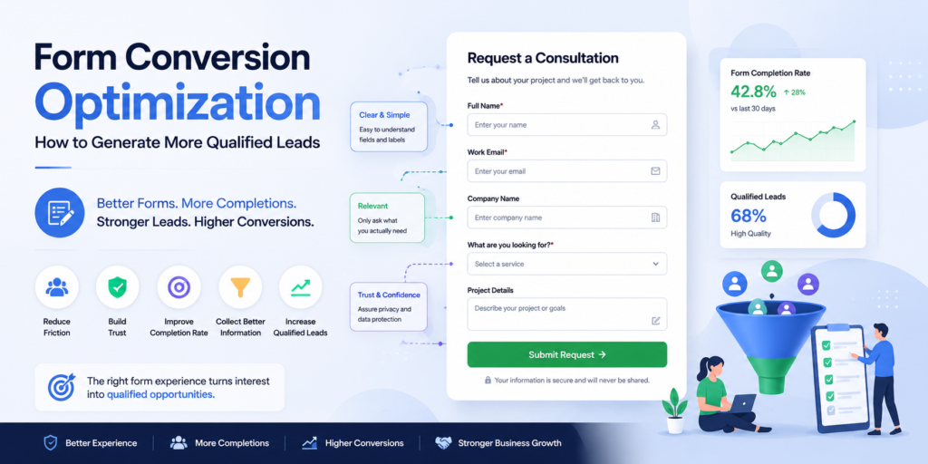
A website can attract the right visitors, present a compelling offer, and guide people toward taking action, only to lose potential customers at the final step: the form.
For many businesses, a form is where visitor interest becomes a measurable lead. But it is also where uncertainty, unnecessary questions, poor user experience, technical problems, and excessive friction can cause visitors to abandon the journey.
Form conversion optimization focuses on improving this critical part of the conversion experience so that more relevant visitors complete the form while the business continues to collect the information it actually needs.
The goal is not simply to generate more form submissions.
A form that produces twice as many submissions but fills the sales pipeline with poorly qualified enquiries may create more administrative work without creating more revenue. A better form experience balances completion, qualification, user experience, and business value.
This makes form optimization an important part of a broader conversion strategy. The form should feel like a natural continuation of the visitor’s journey rather than an obstacle placed between interest and action.
Table of Contents
What Is Form Conversion Optimization?
Form conversion optimization is one practical application of Conversion Rate Optimization, because the form itself can influence whether a visitor completes the intended action or abandons the conversion journey.
A form can be used for many different purposes. A business may use one to request a quote, book a consultation, contact sales, apply for a service, register for an event, request information, or begin another type of commercial interaction.
Because these actions have different levels of commitment, there is no single form structure that works for every situation.
A short contact form may be appropriate when the visitor only needs to start a conversation. A high-value B2B service may require additional information to understand the prospect’s needs before a meaningful conversation can take place.
The objective is therefore not to remove every field.
It is to make every field earn its place by contributing either to the visitor’s next step or to the business’s ability to respond appropriately.
Why Forms Have Such a Significant Impact on Conversion
A form represents a moment of commitment.
Before reaching the form, a visitor may only need to read, explore, compare, or evaluate. Once the visitor begins entering personal or business information, the perceived cost of continuing increases.
That cost is not necessarily financial. It can involve time, effort, uncertainty, privacy concerns, or the fear of being contacted too aggressively after submitting the information.
Even when a visitor genuinely wants the offer, unnecessary friction at this point can interrupt the conversion.
A well-designed form therefore needs to answer an implicit question:
“Is the value I expect to receive worth the effort required to complete this?”
The stronger the perceived value and the lower the unnecessary effort, the easier it becomes for relevant visitors to continue.
Form Length vs. Form Quality
One of the most common assumptions in form optimization is that shorter forms always convert better.
Reducing unnecessary fields can certainly make completion easier, but form length should not be evaluated independently from the purpose of the form.
A business selling a high-value service may need information about project requirements, budget, location, timeline, or business needs before a meaningful conversation can take place.
Removing all of those questions might increase the number of submissions while reducing the usefulness of each lead.
| Form Approach | Primary Advantage | Potential Problem |
| Very short form | Low effort for the visitor | May provide insufficient qualification information |
| Long detailed form | More information for qualification | Can create unnecessary abandonment |
| Progressive form | Information collected gradually | Requires thoughtful UX and implementation |
| Conditional form | Questions adapt to responses | More complex to design and maintain |
| Qualification-focused form | Captures commercially useful information | Requires a strong value proposition |
The best form is therefore not necessarily the shortest one.
It is the form that collects the right amount of information for the value of the next step.
How to Decide Which Form Fields to Include
Every field on a form creates a small amount of effort for the visitor. The more information a business requests, the more carefully it should consider whether that information is necessary at that stage of the journey.
A useful starting point is to separate fields into three categories: information needed to complete the requested action, information needed to understand or qualify the enquiry, and information that may simply be convenient for the business to have.
The first category is usually essential. The second can be valuable when it helps the business respond appropriately. The third should be questioned before being added.
For example, a consultation request may reasonably ask for a name, work email, company, and a short description of the requirement. Asking for information that has no clear connection to the next step can increase friction without improving the experience or the quality of the lead.
The right question is therefore not:
“What information would we like to collect?”
It is:
“What information do we genuinely need to move this prospect to the next appropriate step?”
This is one of the most important decisions in form conversion optimization, because every additional field can affect both completion behaviour and lead quality.
Ask for Information at the Right Time
Not every piece of information needs to be collected during the first interaction.
If a visitor is simply trying to start a conversation, requiring detailed information about budget, company size, implementation requirements, and project history may create unnecessary resistance.
Progressive qualification can allow the business to collect additional information later, once the visitor has demonstrated stronger intent.
This can create a better balance between conversion and qualification.
How to Reduce Form Friction Without Reducing Lead Quality
Reducing friction does not mean removing everything that makes a form useful.
Effective form conversion optimization is therefore less about removing fields and more about removing unnecessary effort from the completion process.
Clear field labels, logical ordering, sensible defaults, helpful instructions, appropriate input types, and a clear CTA can make the completion process easier without changing what the business needs to know.
The surrounding page also matters. A visitor is more likely to complete a form when the value of taking the action is clear and the form feels like a logical next step.
Make Every Field Easy to Understand
Visitors should not have to guess what a field means or what type of information they are expected to provide.
Labels should be clear and specific. If additional information is required, short supporting text can explain why.
For example, instead of simply asking for “Project Details,” a form could explain what information would be useful:
“Tell us briefly what you’re trying to achieve and what you’d like help with.”
This reduces uncertainty and can also improve the quality of the information submitted.
Avoid Unnecessary Required Fields
Required fields deserve particular attention because they can prevent visitors from completing the form.
If a field is not essential to the immediate next step, making it mandatory should have a clear justification.
A useful principle is:
The higher the visitor effort, the stronger the reason for requiring the information.
This becomes especially important on mobile devices, where typing can be more cumbersome and lengthy forms can feel significantly more demanding.
Create a Clear and Compelling Form CTA
The final action should tell visitors exactly what will happen when they submit the form.
Generic labels such as “Submit” may provide very little context. A more descriptive CTA can reinforce the value of completing the form and set an expectation for what happens next.
For example, depending on the purpose of the form, alternatives might include:
Request a Consultation
Get My Quote
Book a Discovery Call
Request More Information
Start My Project
As part of form conversion optimization, the CTA should reinforce the value of taking the next step rather than simply telling the visitor what button to click.
The best CTA depends on the actual action and the promise being made. It should accurately describe the next step rather than exaggerate the outcome.
The surrounding copy can also reduce uncertainty by explaining what happens after submission, such as when the business will respond or what the visitor can expect next.
Build Trust Around the Form
Asking visitors for information creates a responsibility to make the interaction feel safe and predictable.
Trust can be particularly important when a form requests personal information, business details, phone numbers, project information, or other data that visitors may consider sensitive.
The form should therefore provide appropriate context around privacy and data handling rather than assuming visitors will automatically feel comfortable sharing their information.
A short privacy statement, clear explanation of how the information will be used, and an accessible privacy policy can help reduce uncertainty.
Trust also comes from the surrounding experience. Professional design, consistent branding, relevant proof, transparent expectations, and a clear explanation of what happens after submission can all contribute to confidence.
Optimize Forms for Mobile Visitors
A form that feels simple on a desktop computer can become frustrating on a smartphone.
Visitors may need to scroll, tap small controls, switch between keyboards, correct mistakes, or enter information using a smaller screen. These interactions can make even a relatively short form feel demanding.
Mobile form optimization should therefore consider the complete interaction rather than simply shrinking the desktop design.
Fields should be easy to tap, labels should remain visible and understandable, input types should match the information requested, and error messages should clearly explain what needs to be corrected.
The form should also remain usable when the visitor has to interact with it using one hand or while moving through a less stable connection.
This makes mobile experience an important consideration in form conversion optimization, particularly when a significant share of visitors access the website from smartphones.
Make Form Errors Easy to Fix
Errors are an inevitable part of many form interactions. What matters is how easily visitors can recover from them.
An error message such as “Invalid input” provides very little assistance. A useful message explains what is wrong and, where appropriate, how to correct it.
For example:
“Enter a valid work email address, such as name@company.com.”
The visitor should also be able to identify the affected field quickly without losing information already entered.
Good error handling prevents a small mistake from turning into a complete abandonment.
Measure Form Performance Beyond Submission Rate
Website Analytics and Conversion Tracking provides the measurement foundation for understanding how visitors interact with a form, where they encounter friction, and which submissions ultimately contribute to meaningful business outcomes.
A stronger measurement approach looks at the complete form journey. This can include the number of visitors who see the form, the number who begin interacting with it, the number who encounter validation errors, the number who complete it, and the proportion of submissions that become qualified opportunities.
Form conversion optimization should not be judged only by how many people successfully submit a form. Submission volume tells you what happened at the end of the interaction, but it does not necessarily explain where visitors struggled or whether the resulting leads were valuable.
| Form Metric | What It Shows | Why It Matters |
| Form View Rate | How many visitors are exposed to the form | Shows whether visitors are reaching the conversion point |
| Form Start Rate | How many visitors begin interacting | Indicates initial willingness to convert |
| Form Completion Rate | How many started forms are completed | Helps identify form-specific friction |
| Field Error Rate | How often visitors encounter errors | Reveals usability and validation problems |
| Form Abandonment Rate | How many visitors start but do not finish | Identifies incomplete conversion journeys |
| Qualified Lead Rate | How many submissions meet qualification criteria | Connects form performance with lead |
| Lead-to-Customer Rate | How many submitted leads become customers | Shows downstream commercial value |
The most important metric depends on the purpose of the form. A newsletter signup may primarily be evaluated on completion, while a high-value consultation form may need to be evaluated much further downstream.
This distinction prevents businesses from optimizing a form for the wrong outcome.
Measure Where Visitors Abandon the Form
A high form abandonment rate tells you that something is happening, but it does not automatically tell you what is causing the abandonment.
Field-level analysis can provide more useful clues.
If visitors consistently abandon after being asked for a phone number, for example, the business can investigate whether the field creates concern, whether it is necessary at that stage, or whether the surrounding explanation is insufficient.
If visitors encounter repeated validation errors on a particular field, the issue may be related to formatting, unclear instructions, or technical implementation.
This is where analytics and qualitative investigation should work together. Data can identify the point of friction, while user research or usability testing can help explain why it occurs.
Baymard’s usability research similarly emphasizes that analytics can identify where users abandon a flow, while UX investigation is needed to understand the underlying cause.
Improve Form Performance With Evidence, Not Assumptions
Form optimization is often approached through assumptions such as “shorter forms always convert better” or “changing the button colour will increase submissions.”
These assumptions can lead businesses toward low-impact changes while more significant usability problems remain unresolved.
A data-led approach makes form conversion optimization more systematic because each change can be connected to an observed behaviour or measurable outcome.
A better approach begins with evidence.
If analytics shows that visitors abandon the form after reaching a particular field, investigate that interaction. If qualified lead volume is low despite a strong completion rate, examine the information being requested and the traffic entering the form. If mobile visitors perform significantly worse than desktop visitors, investigate the mobile experience rather than assuming the form itself is universally ineffective.
Research from the Baymard Institute provides a useful example of why this distinction matters. Its large-scale checkout usability research has found that overly complex checkout processes can contribute to abandonment, while its testing also emphasizes that not every abandonment is caused by UX problems.
“Analytics tools are excellent at identifying symptoms, but they rarely diagnose the actual problem.”
This is an important principle for form optimization. Data should tell you where to investigate; evidence and user behaviour should help you understand why.
Optimize for Qualified Leads, Not Just More Leads
Increasing form submissions can look like an obvious success, but more leads are not necessarily better leads.
Consider two scenarios. In the first, a form generates 200 enquiries, but only 20 are genuinely relevant to the business. In the second, the form generates 120 enquiries, of which 50 are qualified opportunities.
The second form produces fewer submissions but potentially much greater commercial value.
This is why form conversion optimization should consider lead quality alongside completion rate.
The questions included on a form can play an important role here. Carefully selected qualification fields can help the business understand whether an enquiry matches its service, budget, requirements, timeline, location, or other relevant criteria.
The challenge is finding the right balance.
Too little information can make qualification difficult. Too much information can discourage good prospects from completing the form.
The best form therefore creates a useful exchange:
The visitor provides enough information to receive an appropriate next step, while the business collects enough information to respond intelligently.
Connect Form Optimization With the Wider Conversion Journey
A form should not be treated as an isolated component.
Its performance depends on what happens before the visitor reaches it and what happens immediately after submission.
The landing page needs to establish relevance and value, which is why Landing Page Optimization and form optimization should be considered together rather than as completely separate activities. The form needs to provide a clear and manageable path to action. The submission process needs to work reliably. The business then needs to respond appropriately to the resulting lead.
This is why form conversion optimization is ultimately about continuity.
The experience before the form creates the motivation to act. The form determines how easy it is to act. The process after submission determines whether that action develops into a meaningful business opportunity.
What Happens After a Visitor Submits the Form?
The form submission is not the end of the conversion journey. For many businesses, it is the point where the marketing and sales process actually begins.
A visitor can complete a perfectly optimized form, but if the submission disappears into an inbox, reaches the wrong person, or receives a delayed response, much of the value created by the conversion can be lost.
The post-submission experience should therefore be considered part of form conversion optimization.
Set Clear Expectations After Submission
Visitors should know what happens immediately after they complete the form.
A confirmation message can explain whether the request was successfully received, when they can expect a response, and what the next step will be.
For example, someone requesting a consultation may need to know whether the business will contact them to schedule a meeting or whether they should choose a time themselves.
This clarity reduces uncertainty and creates a smoother transition from conversion to the next stage.
Route Leads to the Right Place
The value of a lead can decline quickly when there is no clear process for handling it.
A form submission should reach the appropriate person or system based on the information collected. Different services, locations, customer types, or enquiry categories may require different follow-up processes.
Effective routing can reduce delays, prevent leads from being overlooked, and help sales teams prioritize opportunities according to their relevance.
Connect Forms With CRM and Other Business Systems
When form submissions are manually copied between systems, there is greater potential for delays, duplication, data-entry errors, and missed follow-ups.
Connecting forms with CRM platforms, email systems, calendars, notification tools, and other business applications can create a more consistent process.
The right integration depends on the business, but the underlying objective is the same: move useful information from the conversion point to the next stage without unnecessary manual intervention.
Automate the Right Follow-Up
Automation can be useful after a form submission, particularly when it handles predictable administrative steps.
A submission could trigger an internal notification, create or update a CRM record, send a confirmation message, assign an enquiry to the appropriate team member, or begin a predefined follow-up process.
Automation should not replace meaningful human interaction where personal communication is important. Instead, it can ensure that routine processes happen consistently while teams focus on conversations that require human judgment.
This is where AI Automation Infrastructure™ can extend the value of a conversion beyond the initial form submission.
How to Test Form Conversion Improvements
Once a form has been measured and potential friction points have been identified, changes should be evaluated systematically.
A useful optimization process begins with a specific observation. If visitors frequently abandon after a particular field, for example, the hypothesis might be that the field creates unnecessary effort or uncertainty.
The business can then test an appropriate change and compare the resulting behaviour with the previous experience.
The change might involve removing a non-essential field, improving its wording, reorganizing the form, clarifying the CTA, changing the supporting message, or improving the mobile interaction.
The important point is that the test should answer a meaningful question.
Measure the Right Outcome
The success of a form change should not always be determined by form completion rate alone.
If removing several qualification fields increases submissions but significantly reduces lead quality, the change may have made the form more efficient while making the overall sales process less effective.
A stronger evaluation can consider form completion, qualified lead rate, sales opportunities, customer conversion, and ultimately revenue where sufficient data is available.
This ensures that optimization decisions are connected to the outcome the business actually wants.
Form Conversion Optimization as Part of Conversion Architecture
A form is only one component of the larger conversion experience.
Visitors need to arrive with an appropriate level of intent, understand the offer, find enough information to make a decision, trust the business, and feel confident taking the next step.
The form then needs to make that action straightforward while collecting the information required for the business to respond effectively.
After submission, the process needs to continue through confirmation, qualification, routing, follow-up, and eventually the commercial outcome.
This connected approach is at the heart of Conversion Architecture System™.
Frequently Asked Questions About Form Conversion Optimization
What is form conversion optimization?
Form conversion optimization is the process of improving a website form so that more relevant visitors complete it while the business continues to collect the information needed for qualification and follow-up.
Should I make my form shorter?
Not necessarily. Removing unnecessary fields can reduce friction, but a very short form may produce insufficient information for qualification. The appropriate form length depends on the value of the conversion and the information required for the next step.
What is a good form conversion rate?
There is no universal form conversion rate that applies to every business. Performance depends on traffic quality, visitor intent, offer value, form complexity, industry, device, and the definition of a conversion. Internal trends and qualified lead outcomes are often more useful than a generic benchmark.
How can I reduce form abandonment?
Start by identifying where visitors abandon the form. Then investigate potential causes such as unnecessary fields, unclear questions, technical errors, poor mobile usability, privacy concerns, or insufficient explanation of what happens after submission.
Should I ask for a phone number on a lead form?
It depends on the purpose of the form and how the information will be used. If a phone conversation is an important part of the next step, the field may be justified. If it is unnecessary or creates concern for visitors, making it mandatory could introduce avoidable friction.
How do I optimize a form for mobile users?
Mobile forms should use appropriately sized controls, clear labels, suitable input types, readable text, helpful validation messages, and a straightforward layout. The complete interaction should be tested on actual mobile devices rather than assuming that a responsive desktop layout is sufficient.
Should every form use the same fields?
No. Different forms serve different purposes and audiences. A newsletter signup, consultation request, quote form, and application form may require very different amounts of information.
How do I improve lead quality without reducing conversions?
Start by identifying which information genuinely helps determine lead quality. Ask only the questions that contribute meaningfully to qualification, communicate why the next step is valuable, and avoid adding fields simply because the sales or marketing team would like to have the information.
What should happen after someone submits a form?
The visitor should receive a clear confirmation and understand what happens next. Internally, the submission should be routed to the appropriate person or system, recorded where necessary, and followed up according to the business’s process.
Conclusion
A form may occupy only a small part of a website, but it can have a significant influence on whether visitor interest becomes a genuine business opportunity.
Effective form conversion optimization is not about making every form shorter or maximizing the number of submissions at any cost.
The strongest forms make the next step clear, remove unnecessary friction, collect useful information, establish trust, work reliably across devices, and connect smoothly with the processes that follow submission.
Most importantly, form performance should be evaluated beyond the initial conversion. A form that generates more submissions is useful only when those submissions contribute to better opportunities, stronger customer relationships, and ultimately better business outcomes.
The goal is not simply to get more people to complete your form. It is to make it easier for the right people to take the right next step.
Turn More Form Submissions Into Meaningful Business Opportunities
If your website is generating traffic but too many potential customers abandon the final step, the form may be creating unnecessary friction—or the information being collected may not be aligned with the next stage of the sales journey.
Mavenify’s Conversion Architecture System™ helps businesses examine these conversion points as part of a connected customer journey, combining experience, messaging, measurement, conversion design, and post-conversion processes to turn relevant visitor intent into meaningful business outcomes.